
How to Use NDepend’s Trend Charts
Editorial note: I originally wrote this post for the NDepend blog. You can check out the original here, at their site. While you’re there, download NDepend and give the trend chart functionality a try.
Imagine a scene for a moment. A year earlier, a corporate VP spun up a major software project for his organization. He brought a slew of his organization’s software developers into the project. But he also needed to add more staff in the form of contractors.
This strained the budget, so he cut a few corners in terms of team member experience. The VP reasoned that he could make up for this with strategic use of experienced architects up front. Those architects would prototype good patterns and make it so the less seasoned contractors could just kind of paint by numbers. The architects spent a few months doing just that and handed the work off to the contractors.

Fast forward to the present. Now a consultant sits in a nice office, explaining to a beleaguered VP how they got so far behind schedule. I can picture this scene quite easily because organizations hire me to be this consultant. I live this scene over and over again.
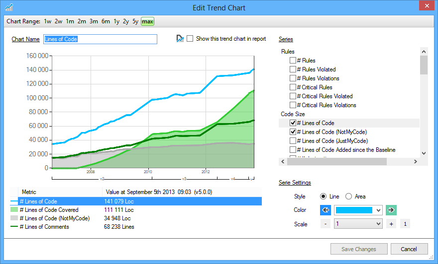
NDepend Trend Charts
Concepts like technical debt help quite a bit. I also enlist various other metaphors to help them understand the issues that they face. But nothing hits home like a visual. I’ve described this before. Generate an actual dependency map of their codebase and show it next to the ones the architects created in Visio, and you invariably see a disconnect.
Today, I’d like to take a look at another visual feature of NDepend: trend charts. These allow you to see a graph-style representation of your codebase’s properties as a function of time. And you can customize them a great deal.
In the scene I painted for you a moment ago, the VP—and the people in his program—feel pain for a specific reason. They go far too long without reconciling the plan with reality. I come along a year in and generate a diagram that they should have looked at all along.
Trend charts, by design, help combat that problem. They allow you to get a feel for strategic properties of a codebase. But they allow you to see how that property varies with time. You can take advantage of that in some powerful ways.
Keep an Eye on Things
First, let’s look at the most obvious use of trend charts: keeping an eye on things. Think of some properties in your code that you’d want to keep tabs on and plot them on a graph.
For instance, you might want to look at average cyclomatic complexity and lines of code per method. Generally speaking, you would expect these figures to remain relatively flat (and low) in a codebase. You could use a trend chart to confirm this and keep tabs.
Does the trend line stay pretty much flat, with a little uptick or downtick here and there? Or does it trend slowly but steadily upward? Observing a trend like this can help you catch an issue much earlier than you otherwise might. Whenever I see a codebase with heinous method complexity, I understand that nobody went in and made it that way in an afternoon. It took years of not noticing a general, gradual trend.
Audit the History of Your Code
When you monitor key properties of your code in real time, you tend to catch things early. But maybe now it’s too late for that, or maybe you just want to understand something retroactively. You can use trend charts to achieve this as well.
With some finagling, you can grab old version of your code and analyze them retroactively. This creates trend charts for the past, allowing you to see what happened over the course of time.
When did all of this complexity creep in? And when did all of those technical debt issues and warnings come up? Looking back at a trend chart, you can correlate it with events over the course of your development.
Gamify Improvement
So far, I’ve talked about prevention and post mortem analysis. Let’s talk now about active improvement.
With trend charts, you get access to a ton of properties to plot. These include attributes with positive connotations, such as test coverage and the number of fixed issues. If you plot these on a big, visible trend chart for the whole team to see, they add some gamification. The team can see the needle moving in a good direction and will want to continue that trend.
You can do the same thing on the flip side with metrics that have negative connotations. For instance, you might plot the number of issues, amount of technical debt, rule violations, or critical issues. Watching these numbers decrease over time becomes a source of pride for the team. So they’ll work to decrease them while also trying not to introduce new ones.
This works particularly well in situations that start out with a lot of problems (i.e., most of the ones I wind up seeing). Having a static analyzer tell the team that the code has thousands of issues can be demoralizing. But chipping away at those issues and steadily bringing them to heel makes the team feel good.
Look for Interesting Correlations
Lastly, I’ll offer something a bit abstract. You might think of this as intermediate- or advanced-level trend charts usage.
When you use a tool to generate a graph for you over the course of time, you gather and organize data at low cost. You can then use this data in interesting and unforeseen ways. This is the same principle that drives the big data analytics movement.
NDepend lets you plot variables like the number of source files, the number of lines of code, and the number of dependencies. You can introduce trend charts for these things without any specific purpose other than for the sake of data gathering. After all, you’re not looking to encourage or discourage, say, a change in the number of lines of code.
After gathering this data for a while, you might notice interesting correlations. You add twice as much code on Friday as any other day of the week. Or you had a huge uptick in dependencies right after Josh joined the team.
What do these things mean? Should you act on them? I can’t tell you that in the hypothetical, which is why I said that this is a more abstract and advanced use case. You have to figure that out for yourself. But you might as well collect the data because you never know what helpful observations you’ll make.
Data and Visualization Are Power
Speaking from experience, once you set this stuff up, you come to find it indispensable. You feel positively blind without it.
Every time I show visualizations of a codebase to a client or give them access to new data, they always want me to set something up so they can keep examining it. Why wouldn’t they? This makes total sense.
But life for the team and the department would go far better if it were them generating this data instead of a consultant. This would mean that the team was surfacing appropriate information and having the right conversations.
So have a look at trend charts. At the very least, they’ll give you more information about your own codebase. Quite possibly, they will prevent you from being in a situation where an outsider comes in to help you figure out where things went sideways.